DAX Date Table
- DataZoe

- Jul 31, 2021
- 2 min read
There are a lot of different Date tables out there, and this is mine! This one features things I add in many of my reports, which is a month that can be continuous on charts and offsets to add a slicer for current.

This is using DAX.DO, so to use in your report change EVALUATE to Date =
It's shown embedded here, but if you have issues, use this link: https://dax.do/qLwmfU32g2WkQQ/
To add follow these steps:
Copy the DAX
In Power BI Desktop go to Modeling Ribbon > New Table
Paste in the DAX
Remove EVALUATE and uncomment (remove the --) in front of Date =
In Table Tools Ribbon > Mark as Date Table. Choose the [Date] column.
Now to format the columns! You can do this by clicking on the column in the right pane, clicking on the column in the Data view, or the properties pane in the Modeling view!
For [Date] I usually pick dd-mmm-yy
For [Yearly] I usually pick yyyy.
for [Quarterly] the quarter date formats don't work (https://docs.microsoft.com/en-us/dax/format-function-dax) so until Qq works, I just use mmm yyyy (Q).
For [Monthly] I usually use mmm yyyy.
For [Weekly] I usually use mmmm dd to differentiate it from the [Date] format.
All those will sort as you'd expect, and do continuous axis as well as categorial. The rest have to have a little help :). (Column Tools Ribbon > Sort by Column)
Sort the [Year Quarter] by [Quarterly]
Sort the [Month] by [Month of Year]
Sort the [Year Month] by [Monthly]
Sort the [Week] by [Weekly] (super surprising ha!)
Additionally, this is the date extension I also use! To add in a slicer for specified DATE RANGES. Link in DAX.DO here: https://dax.do/mTL80eWxRtW238/
As the sort column suggests, you should sort the [Date Range] by [Sort] column.
Here is how the relationships should look when you are done:

And here it is all in action:

The top two use the [Monthly] column, left as continuous and right as categorical. In this one it doesn't introduce the slider but the continuous is great for smaller KPI type line charts. The lower right chart is using the [Year Month] column.
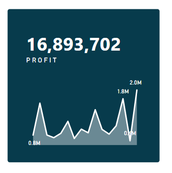
Here is showing the categorical vs continuous on a smaller line chart:


Then you have the [Date Range] slicer that will continually adjust to current day. So you can publish the report with default of "Last 6 Months" and it will roll automatically.

Hope this helps you with your reports!


Comentarios